
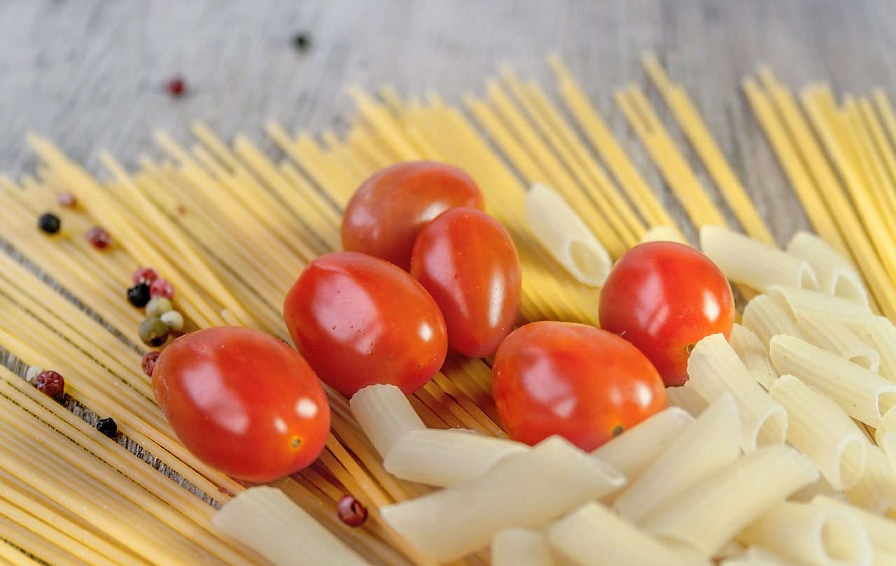
Color – The Spice of Life
24
Febuary, 2018
Color: Flavoring Your Visuals Well
Color tells a picture’s story much the same way aroma tells us what’s for dinner. With up to 92.6% of people saying that visuals are the #1 influencing factor affecting their purchase decision, it is important to make sure your website’s colors reflect your brand and targeted audience. Do you want a vibrant, spice-filled image that gives the viewer a hundred and one things to discover? Or do you want to focus on one specific flavor?
93% of consumers place color and appearance above other factors when making a buying decision.
As with spices, the type and amount of color you use makes a dramatic difference in how your work is perceived. If you want to evoke a certain emotion, thought or “flavor,” you will use different colors as your ingredients. An excellent chef will include specific spices to achieve their meal’s desired outcome. As a designer, it’s important to know how color affects your work.
Mixing Colors – Enhancing Flavor
Certain combinations fit well together: salt and pepper, black and white, to name the simplest of ingredients. There are also many that don’t work well together: red and neon-orange, vinegar and milk. There is a time and place for every color. The key is knowing when and how to use them.
Classic examples include:
- White (or whitespace usage) to indicate cleanliness and purity
This is often used by hospitals or informational sites like Wikipedia. - Black to indicate classiness and power
High-end restaurants and tech companies tend to favor these - Blue for stability and trust
We see these a lot with doctors and insurance companies.
Combining white, black, and blue can visually indicate that the company is a safe, powerful, and trustworthy company – Microsoft.com is a perfect example. They use a great deal of whitespace, a menu that contains a splash of blue, and well-placed usage of black, all culminating towards the concept of trustworthy, powerful, and secure technologies.
Brand recognition, which links directly to consumer confidence, is increased by 80% when the right colors are used – Business Insider

Directing through Color
Planning your colors well is essential. Knowing what feelings or actions you want to evoke in your viewers will inform your decisions on what colors to include. Before you commit to using certain colors, there may be restraints on what colors should be used.
Consider these questions:
- Are there specific colors I should or should not use because of my logo or a branding?
- Are those the right colors? Should you re-brand? (Bad colors in a brand can stifle your business)
- What do you want viewers to sense from the visuals – e.g. an organized, laser-focused product? A fun, tasteful splash? A high-energy adventure?
- How much of a color should be included? Should a color be a subtle splash or the main color?

Color Psychology and Branding
Canva.com has fantastic explanations and examples of the meanings behind many colors. Check out their Color Meaning and Symbolism article if you’re not sure which meanings your colors convey. Also, check out Jen’s Reviews for more on the history and what each color represents. Keep in mind, the colors you choose indicate the “flavor” of your company. Colors should enhance your brand and integrate into your overall strategy. You want potential customers and clients to not only appreciate the taste and color choices found in your brand, but also to enjoy the journey as they browse through your site.

Tim
Three of my favorite things include physical activities, excellent fantasy/Sci-Fi books, and a good challenge. I love seeing creativity and hard work paying off.

The Power of Personalization for the Small Business
As a small business owner it’s up to you to use the power of personalization to improve your sales and your customers’ experience.

Sell an Experience, Not a Product or Service
Why do customers often choose to work with small, independent businesses rather than the larger, cheaper options?
Developing Your Site!
We would love to help you set up your website. For more details, please fill out the request form!